

“People will stare. Make it worth their while.”
– Harry Winston
I love clothes. I don’t know why; but I do. I also love travel. Unlike clothes, I know full well why I feel this way – I’m captivated by new experiences.
In 2013, I embarked on an adventure of Australasia, South-East Asia, and South Africa; and, somewhere in between my ‘big idea’ finally came to me – a brand inspired by travel. All pieces would be a homage to places across the globe; and, subsequently, convey something special.
It was a sure winner. Except it didn’t have a name. Yet. In January 2014, an ‘inspirational’ trip to London and Paris was therefore deemed necessary.
Exploring the streets of two iconic cities did the trick. Not only was I able to explore, take many photographs, and have an all-round great time; but a name, and tagline, came to me. The brand was to be called ’80 Days’ – a throwback to Jules Vernes’ famous novel – and the tagline was to be ‘Get Lost’ – a provocative play on words.
Upon returning to New Zealand in March 2014, I decided to turn my idea into a reality. First step? It’s logo, of course.
To be completely honest, I had no idea what I was after. I knew it had to be edgy. Yet it also had to memorable and (somewhat) appropriate. This was, hopefully, going to be something many people would happily flaunt on their chests.
In a bit of a rut, I turned to my design partner-in-crime – Dejan Miletic – and asked him to surprise me. He was immediately inspired by the concept and promised something exceptional within a couple of days.
Now, I’m not one to succumb to hype; and, naturally, thought it was an empty promise. Dejan’s an excellent designer. Of that there is no doubt. However, the likeliness of him capturing my exact hopes and dreams for the brand were rather slim.
How wrong I was.
Dejan shared one design concept with me and that’s the logo in use today. For me, it’s perfect. It perfectly encapsulates the travelling ethos of the brand in an edgy, creative manner; and, additionally, does so in a flexible manner. Whilst it’s predominantly shared in black and white, the logo works with any colours.
Travels to South America (for the 2014 FIFA World Cup) and China halted further progress; and, subsequently, it wasn’t until 2015 that I revisited the brand.
Extremely excited and drunk from summer sun, I rushed into designing pieces. An extremely naïve and costly decision; but we’ll discuss that later.
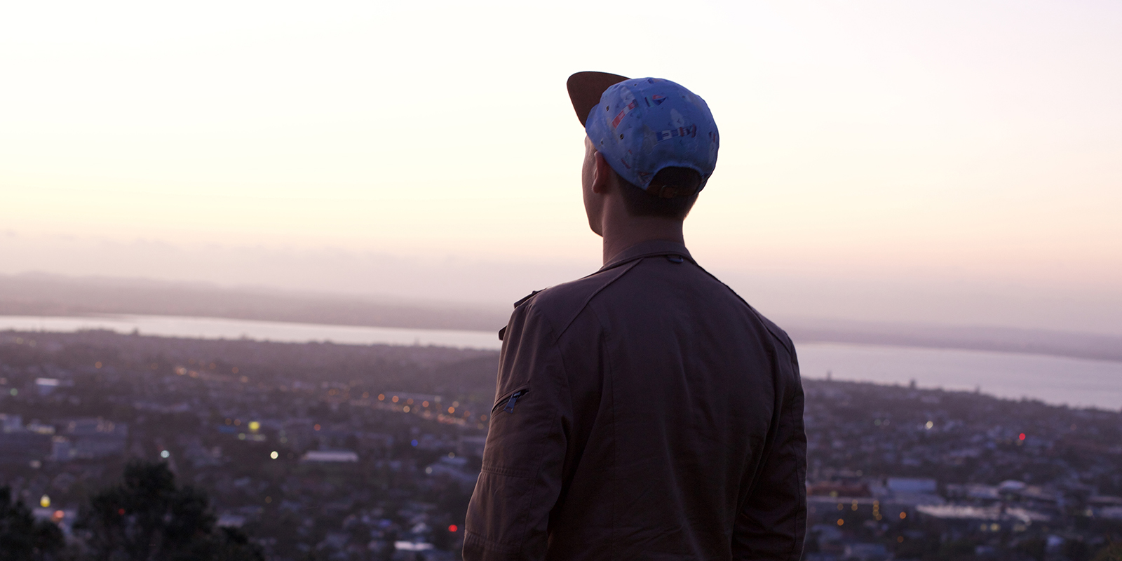
A brief look at other NZ brands (such as GOVERNOR and DSCRT) showed there were three key pieces to create – t-shirts, long sleeves, and hats – and create I did. I ordered fabrics online, found a hat manufacturer, and commissioned 50 hats to be made. Then I opened Illustrator, found a screen printer, sourced blank clothes, and commissioned 75 t-shirts, and 15 long sleeves, to be printed.
At the time, I remember thinking it was too good to be true. I had a tonne of product on the way and absolutely nothing was standing in my way of creating a fashion empire.
Then I received the first batch of 80 Days gear.
The hats were OK; but, due to my haste, they were six panels (instead of five). Personally, I wasn’t a fan but knew I had to put on a brave face. I had been hyping my fashion genius for weeks and I wasn’t about to let anyone poke a hole in my self-created bubble. What’s more, some of the colour combinations just didn’t work. The hats with lighter peaks were passable; but those with darker didn’t look too flash.
The t-shirts were absolutely atrocious. I’m not a graphic designer; and, well, that became rather evident upon opening each set. Not only were the design’s weak but I hadn’t formatted the printing files correctly. The result? Extremely thin lines.
Thankfully, the long sleeves were a saving grace. Pulling them out of the box somewhat made up for the previous atrocities. However, they wouldn’t be enough to salvage the first collection. There were simply too many poor pieces.
On top of this, summer had come to an end and the days were getting shorter, cooler, and generally more miserable. I knew it was a terrible time to launch t-shirts and headwear but what would could I do? I’d already invested so much time and money into the brand; and, subsequently, felt I had nothing to lose.
The initial results were disappointing. Whilst I was able to generate a small following on Facebook, orders were rather slow; and, consequently, I lost a lot of passion for the brand.
Looking back, it’s not hard to see why this was. I had severely underestimated the research process, put too much faith in my basic design abilities, and never sought out the sort of constructive criticism that was essential to success. I had also been naïve enough to think people would buy summer clothes during New Zealand’s winter.
Knowing something drastic had to be done, I enlisted the help of a good friend and work colleague – Finn Dinneen. A rather frank discussion lead to a number of changes.
80 Days was to become a headwear company. It would cut its losses on the t-shirts and focus solely on making kick-ass hats people grew to love.
Our first major change was to standardise the type of hat we were creating. We fixed my previous six panel area (by using a five panel design) and used a suede tan peak, and logo patch, on all new items. Why? Because it just looked better and we felt consistency was key. As a new brand, we still needed to create that ‘I know what I’m getting’ feeling so critical to success.
Additionally, our online ‘persona’ was to transform.
Prior to Finn’s involvement, the brand spoke in third-person. Why? Because one of my marketing heroes, Sasha Strauss, did so; and, like all good fan boys, I decided to emulate his approach. I didn’t believe this strategy was negatively affecting the brand. However, following Finn’s lead, I embraced our new first-person approach. The result? A dramatic improvement in engagement. People responded warmly to 80 Days more colloquial ways; and, as a result, we stuck by it.
We also began sharing interesting travel, fashion, and music, articles. Why? To curate 80 Days’ ideal culture. Naturally, we marginalised a few of our existing followers doing this – not everybody likes exploring the world, wearing ‘out-there’ garments, or listening to non-mainstream musicians. Yet that was OK. By creating something that was truly ‘us’, we were able to find, and engage with, like-minded individuals in an authentic manner.
Sales picked up, too, despite that fact we were primarily marketing in winter markets. I’m not too sure why. Personally, I believe it was down to our new-found authenticity; but it’s a hard thing to prove one way or another. Too much time has passed from those initial orders to find out now.
With extra energy in our step, Finn and I decided to experiment with more innovative marketing methods. What were these? A mixture of superimposed Facebook advertisements and social media collaborations. There was a ‘Lion King’ ad for our Botswana five panel, a ‘Donald Trump’ ad for our Mexican, product photographs by the lovely Kathryn Rossi, and a kick-ass video from the super-creative Chase Madsen (aka Chase vs. Everything).
All were relatively successful in terms of driving sales but there were also many more intangible benefits – perception, culture, and awareness. I think it’s safe to say all improved our position in the market; and, today, we’re experiencing much better results than a meagre three months ago.
80 Days has been a hell of a ride. That’s for sure. However, looking back, I’d have it no other way. Personally, this project has allowed me to grow exponentially on both an individual, and business, level; and, subsequently, laid the foundations for a bright future.
There’s a long way to go. I know that. However, I’m excited by the future and look forward to all new challenges that are thrown our way.