Branding, Copywriting, Web
Working closely alongside Persolvo, we were able to help them stick out in a crowded space. Clean branding and direct copy communicated detailed information in an uncomplicated and uncluttered manner.


Working closely alongside Persolvo, we were able to help them stick out in a crowded space. Clean branding and direct copy communicated detailed information in an uncomplicated and uncluttered manner.
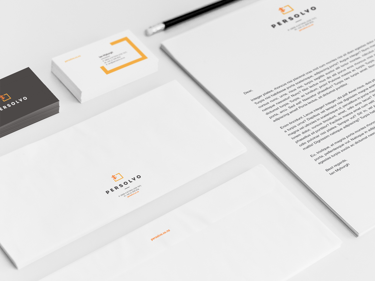
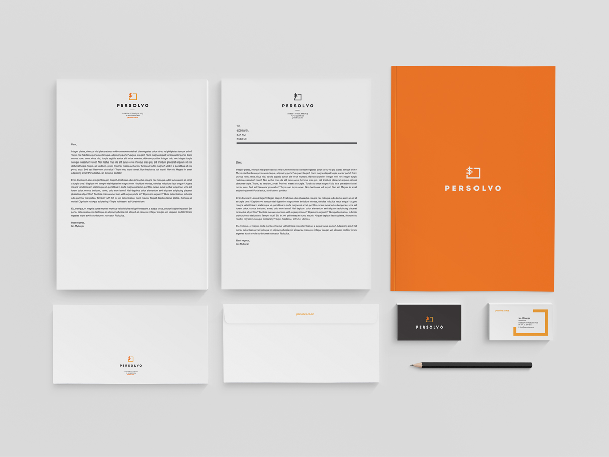
Anchoring the brand, a logo is the single most visible manifestation of a company; and, subsequently, requires a great deal of thought during creation. Through the use of colour, font, and imagery, they can provide essential information about a company and allow consumers to identify with the company’s core vaues. Naturally, we were excited to see how we could help Persolvo with theirs.
To truly create an effective logo, you must first understand the market you’re in; and, additionally, know what other logos you’ll be bumping shoulders with. In Persolvo’s case, the market was saturated with many EFTPOS companies occupying the same space.
As a result, we needed to create something different to the basic green and blue designs already in existence. The solution? A pixelated, orange theme – a stark contrast to Persolvo’s competitors.
In the same way we, as individuals, purposefully portray ourselves how we wish to be perceived, so too does a company. This is known as their ‘brand identity’.
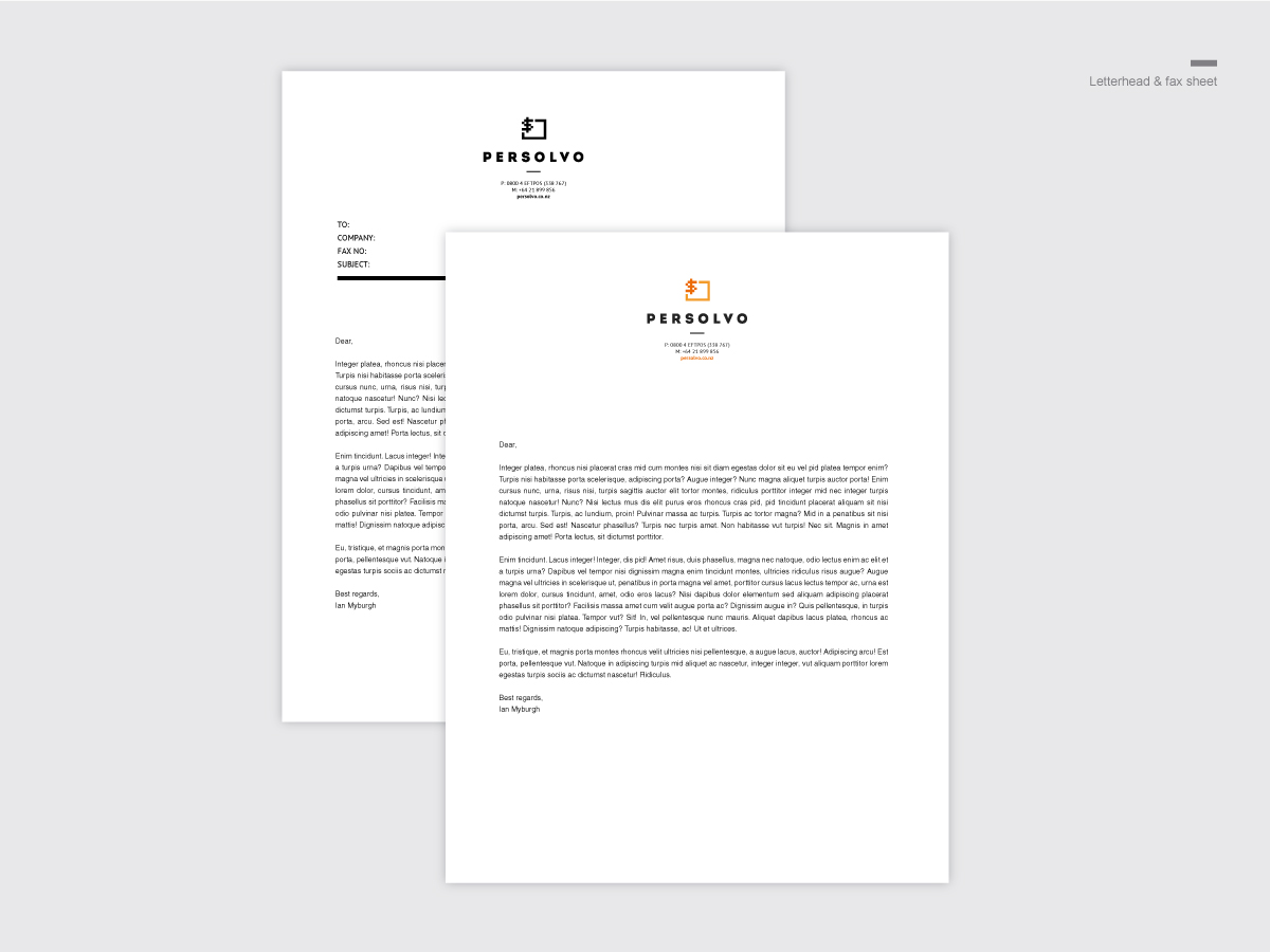
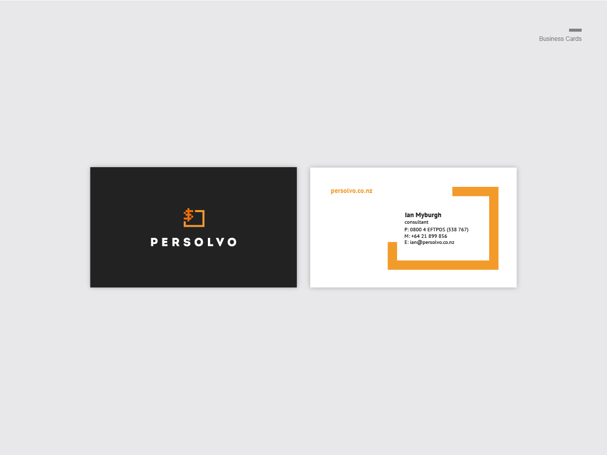
As a natural extension of the logo, brand identities incorporate all other aspects of a company – name, tone, tagline and typeface – in an attempt to reflect the value they bringto the market.
In order to build an effective brand identity for Persolvo, we had to ensure it was striking and welcoming in an industry otherwise perceived as complex and technical. Persolvo’s brand needed to seem ‘friendly’ and easy to deal with.
An ‘uncluttered’ approach was taken. We focused on a black and white theme with orange highlights. This natually extended from the logo, and portrayed Persolvo’s simplicity.
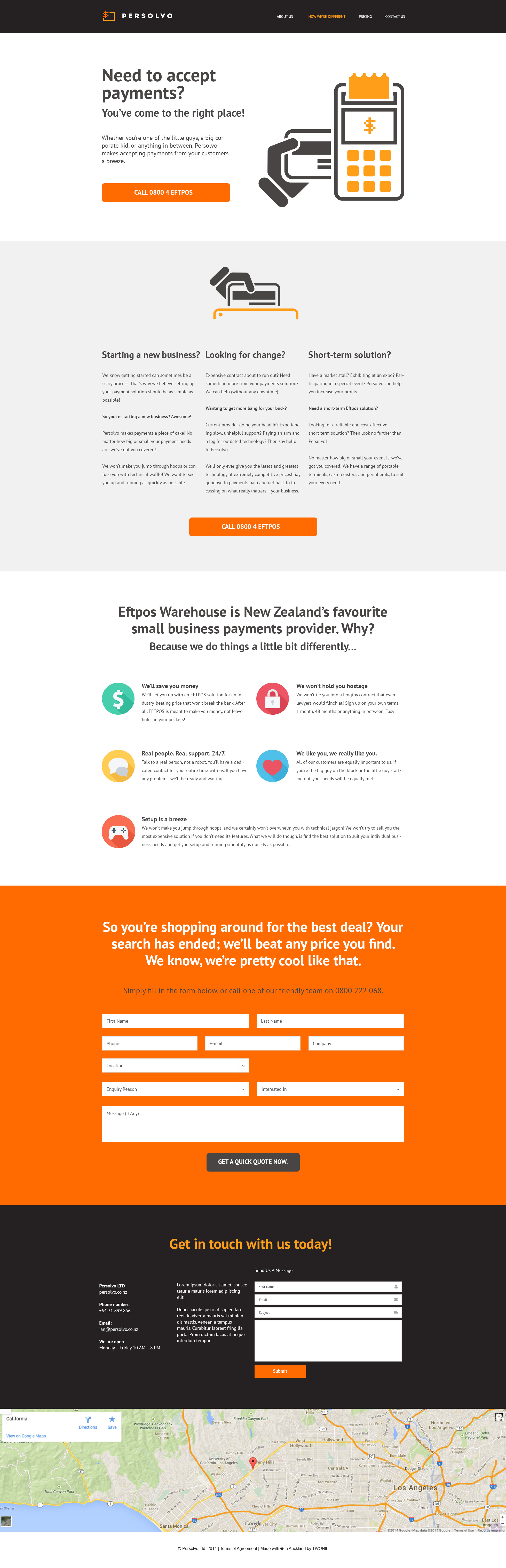
Giving consumers a reason to stop online is essential. If your website is not up to standard, viewers will simply move on – there’s always an alternative. This doesn’t only apply to the aesthetics of your website, though. Consumers will likely become frustrated if the functionality is confusing or doesn’t work correctly. Luckily for Persolvo, we’re experts in ensuring this doesn’t happen.
Persolvo’s website needed to be a visual representation of their new brand identity. It needed to evoke a sense of clarity. It need to be uncomplicated.
To achieve this, we created a one-page website with ‘key information’. By ensuring the content of the website was kept to a minimum, direct, and to the point, we were able to effectively visualise Persolvo’s ‘uncluttered’ approach.
I worked as the creative director on this project; and, subsequently, was responsible for ensuring designers, animators, and the project stake holders, turned this fantastic idea into an exciting reality.