Branding, Web
GenCap were looking to create a conservatively modern brand and curate an enjoyable online presence. Through minimalistic design, we were able to communicate their offering in a simple and engaging manner.


GenCap were looking to create a conservatively modern brand and curate an enjoyable online presence. Through minimalistic design, we were able to communicate their offering in a simple and engaging manner.
When creating a logo, it’s important to understand two fundamental elements of your business – its values and tone. Why? Because the most visible representation of your brand will solicit specific emotions; and, as a result, it’s essential all colours, texts, shapes, and other design elements, work effectively. Thankfully, GenCap were in capable hands.
Tasked with designing a professional logo of stature, we took a rather conservative approach. Bold, strong lettering was used to create a sense of standing. Green and blue colouring were used to evoke their associated emotions – wealth (relatable to the finance industry) and calmness (relatable to safety of investments), respectively.

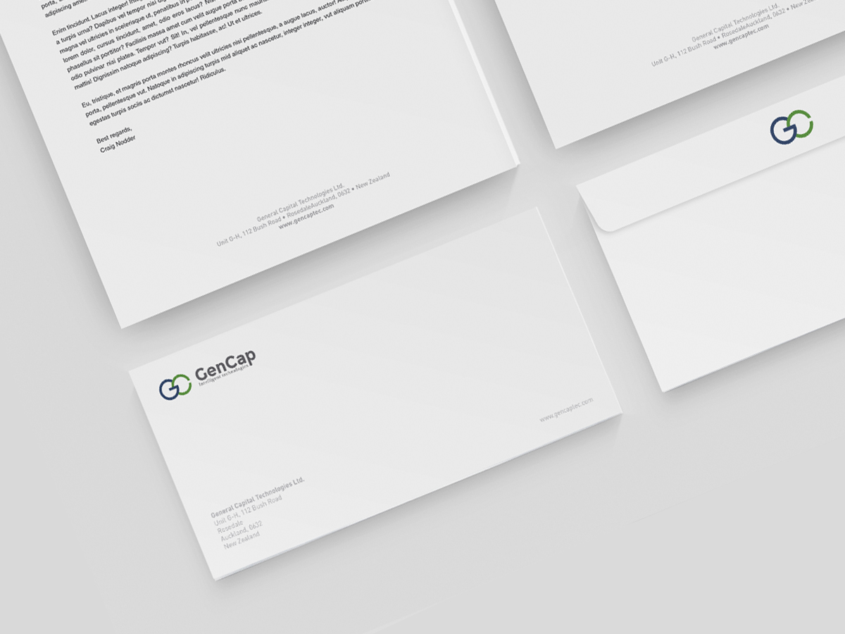
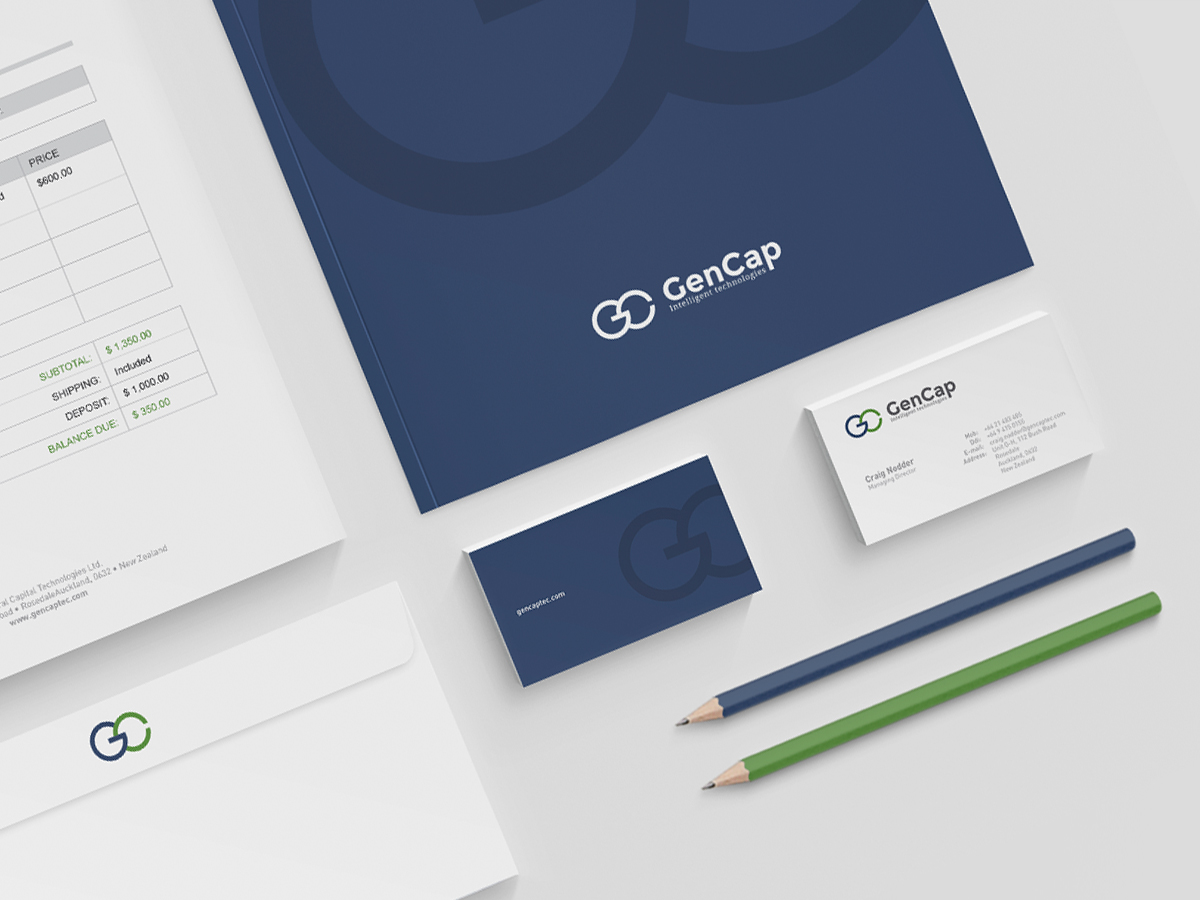
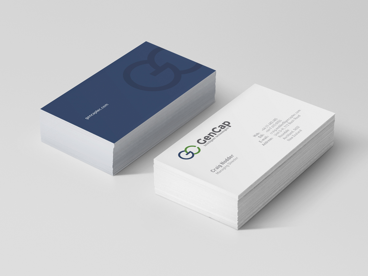
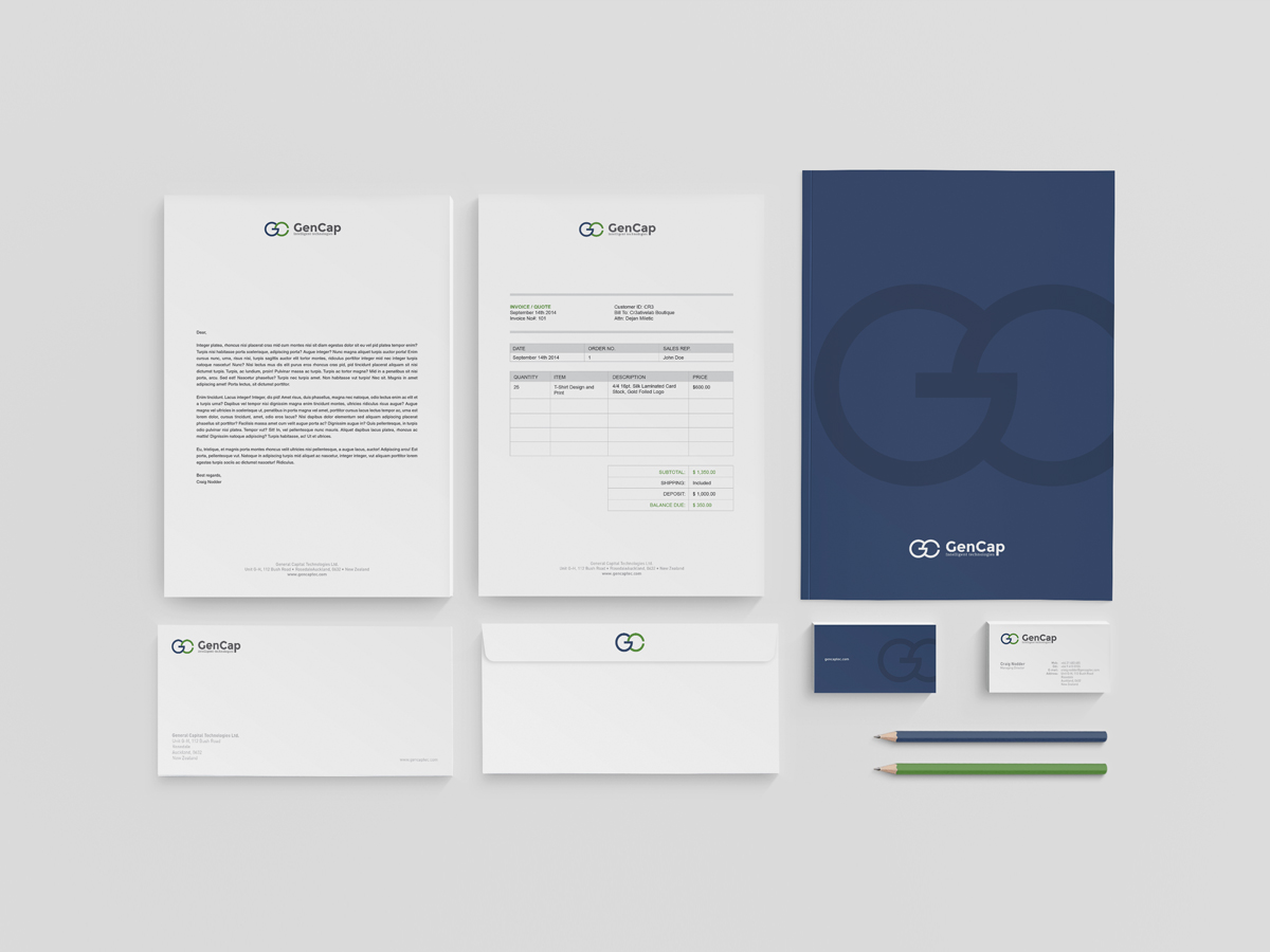
A brand identity is much more than a company’s product or services. It’s what a company stands for. It’s how a company expresses itself. It’s the sum of every interaction consumers have with a company. There’s no doubting brand identities are an integral aspect of business, then.
We crafted GenCap’s brand identity as a natural extension of their new logo. A simple, aesthetically pleasing approach was utilized a modern sense of stature within the industry.
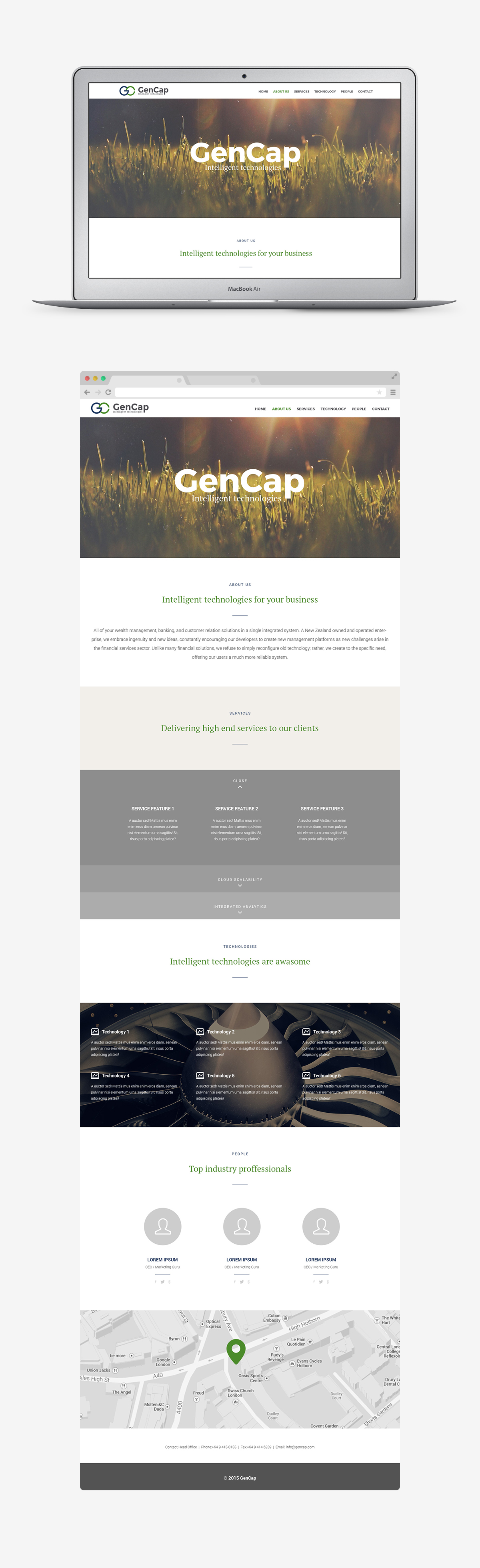
Size doesn’t matter online. If your website is up to standard, you’ll look just as good as the big guys. You may even surpass them as most typically rest on their laurels and previous trading history.
It’s essential you craft a strong online presence, then. Most consumers research companies online before making a purchase; and, as a result, it’s essential a sense of credibility is evoked throughout your site. A poorly made website is viewed as a reflection of the company itself.
Working alongside GenCap, we ensured their website was understandable and modern. Simplistic design and a neutral colour scheme countered ‘heavy’ content and made the site more relatable.
I worked as the lead designer on this project; and, subsequently, was responsible for ensuring all work was created to the client’s specifications.